WHERE AMERICANS ARE MOST BURDENED BY DEBT
Prism · Personal Finance
Federal Reserve / Census Bureau · Q1 2025
AMERICANS ARE
MOST BURDENED
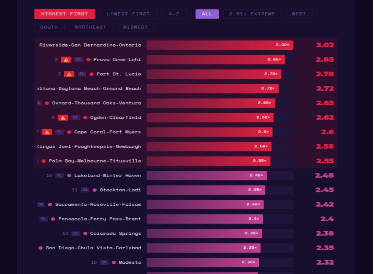
BY DEBT A debt-to-income ratio of 2.51 means debt is more than 2.5× annual income — and monthly payments alone absorb 20–25% of take-home pay before a dollar is spent on food, rent, or healthcare. The geography of household debt reveals precisely where the American affordability crisis has become a debt crisis.
Metric: Household Debt-to-Income Ratio · Metropolitan Statistical Areas ≥500,000 population
Debt includes both secured (mortgage, auto) and unsecured (credit card, student loan) debt
From a sample of consumer credit reports · Q1 2025
Sources: Federal Reserve · Review of Economic Dynamics · U.S. Census Bureau
Debt includes both secured (mortgage, auto) and unsecured (credit card, student loan) debt
From a sample of consumer credit reports · Q1 2025
Sources: Federal Reserve · Review of Economic Dynamics · U.S. Census Bureau
📊 What does a ratio of 2.51+ mean? Debt exceeds 2.5× annual income. Monthly debt payments alone can absorb roughly 20–25% of take-home pay before any living expenses — effectively making every dollar spent on food, utilities, or childcare a choice between necessities.
Household Debt-to-Income Ratio · US Metro Areas · Q1 2025
● 1.79–2.06 · Lower burden
● 2.06–2.51 · Mid burden
● 2.51+ · Extreme burden
Bars scaled to max ratio
Filter by region / tier
Filter by region / tier
Ratio 1.79–2.06
Elevated
Debt is 1.8–2.1× annual income · Monthly payments ~14–18% of take-home pay
Ratio 2.06–2.51
High
Debt is 2.1–2.5× annual income · Monthly payments ~18–22% of take-home pay
Ratio 2.51+
Extreme
Debt exceeds 2.5× annual income · Monthly payments absorb 20–25%+ of take-home pay
Sources: Federal Reserve · Review of Economic Dynamics · U.S. Census Bureau · Household debt includes secured and unsecured · From consumer credit report sample · Q1 2025
3.0+Riverside-SB-Ontario
Extreme Tier
Extreme Tier
FloridadominantMost Extreme
Metros in Dataset
Metros in Dataset
20–25%Take-Home Pay
Absorbed by Debt
Absorbed by Debt
$4,214Avg Household
Annual Interest
Annual Interest
The Geography of Debt Stress
A household debt-to-income ratio is one of the most direct measures of financial stress available in consumer finance data. It captures not just how much a household owes, but how that debt relates to the income available to service it. A ratio of 2.5 means that total household debt — mortgage, auto, student, credit card — equals 2.5 years of pre-tax income. At prevailing interest rates and standard amortisation schedules, that level of debt typically requires monthly payments equivalent to 20-25% of take-home pay, before a dollar is spent on rent (if you're a renter on top of a mortgage), food, healthcare, transportation operating costs, or any of the other necessities that constitute the actual cost of living.
The geographic pattern of extreme debt burden in Q1 2025 is not random. It traces the intersection of two forces: high housing costs (which inflate mortgage debt for those who own) and high consumer debt (auto, student, credit card) in markets where the cost of living has outpaced income growth. The result is a specific set of metropolitan areas that combine high-cost real estate with middle-income workforces — the classic affordability crisis geography of inland California, coastal Florida, and several military-adjacent markets.
A debt-to-income ratio of 2.51+ isn't just a number. It means that before paying rent, groceries, or utilities, 20–25% of every dollar earned is already committed to servicing debt. It is the arithmetic of a financial trap.
Inland California: The Affordability Displacement Zone
Riverside-San Bernardino-Ontario, Provo-Orem-Lehi, and the Central Valley metros of Sacramento, Stockton, Modesto, and Fresno appear repeatedly in the high and extreme debt burden tier. The mechanism is California's — and more broadly the Western U.S.'s — affordability crisis geography: housing prices in coastal markets (Los Angeles, San Francisco, San Diego) have exceeded what most working families can afford, driving population displacement to inland markets where housing is relatively cheaper but incomes are also lower and the California state cost structure (taxes, regulations, cost of living) remains high.
Families who purchased homes in Riverside-San Bernardino or the Central Valley in the 2018-2022 period — when home prices in these markets rose sharply as coastal refugees competed for available inventory — now carry mortgage debt that is large relative to local income levels. These are not families who overextended into luxury properties; they are families who paid market prices for ordinary homes in markets where ordinary home prices have exceeded what ordinary local incomes can comfortably service. The inland California debt burden is housing affordability crisis expressed as a debt metric.
Florida's Concentration: Retirement, Tourism, and the Cost of Living
Florida's concentration of high-debt metros — Port St. Lucie, Deltona-Daytona Beach-Ormond Beach, Cape Coral-Fort Myers, Palm Bay-Melbourne-Titusville, Lakeland-Winter Haven, and Pensacola — reflects specific Florida demographics and economic dynamics. Florida has experienced extraordinary population growth from in-migration, particularly from higher-cost states including New York, New Jersey, Illinois, and California. Many of these migrants moved to Florida for lower taxes and a lower cost of living relative to where they came from — but found that Florida's housing market had appreciated significantly in anticipation of exactly this migration, compressing the cost advantage they sought.
Florida also has a disproportionate share of workers in tourism, hospitality, retail, and healthcare — industries characterised by moderate income levels relative to the broader labour market. When housing costs rise but local wages do not keep pace with the incoming migration-driven housing market, the debt burden for locals and newer arrivals without equity from previous home sales becomes acute. The extreme debt burden metros in Florida are not primarily wealthy retirement communities — they are working-family markets where incomes are middle-to-moderate and housing debt has risen sharply relative to those incomes.
Military Markets: Killeen-Temple and the Base Economy
Killeen-Temple, Texas — home to Fort Cavazos (formerly Fort Hood), one of the largest military bases in the world — appears in the data as a high-burden market. Military towns represent a specific debt burden dynamic that differs from the California or Florida patterns. Military family finances are shaped by the combination of relatively modest base pay (though supplements and housing allowances are significant), a transient lifestyle that prevents building home equity across multiple assignments, and the specific consumer debt patterns of younger demographic groups (auto loans, credit cards) that characterise the military-age population.
The predatory lending ecosystem that has historically surrounded military bases — payday lenders, high-APR auto dealers, rent-to-own retailers — has been partially addressed by the Military Lending Act, which caps interest rates on loans to active-duty service members and their dependents. But the structural debt burden of military communities remains elevated relative to comparable income groups in non-military markets, reflecting both demographic composition and the geographic isolation of many military towns that limits retail competition and creates specific cost pressures.
What the Debt Ratio Misses — And Why It Matters Anyway
The debt-to-income ratio, as a measure of financial stress, has limitations that are worth acknowledging. It does not distinguish between debt types — a household with high mortgage debt and a well-appreciated property has a very different risk profile than a household with equivalent total debt in student loans and credit cards. It does not capture liquid assets — a household with debt exceeding 2.5× income but substantial savings or investments is fundamentally different from one with the same debt ratio and no savings buffer. And the income denominator in the ratio reflects reported income, which can understate economic resources in households with significant untaxed wealth or business income.
These caveats noted, the debt-to-income ratio remains one of the most useful single indicators of household financial vulnerability. Its geographic pattern in Q1 2025 — concentrated in markets where housing cost growth has outpaced income growth, with Florida's retirement-migration and California's affordability-displacement patterns particularly prominent — maps closely onto the geographic pattern of financial distress visible in delinquency rates, credit score deterioration, and bankruptcy filings. The metros with the highest debt burden ratios are not randomly selected. They are the places where the American affordability crisis has been most acute and most persistent.
India's urban debt burden story is still being written. Rapid urbanisation and rising home prices in Mumbai, Delhi, Bengaluru, and Hyderabad are creating a new class of urban homebuyers who have taken on mortgage obligations that represent very high multiples of their current income — a dynamic that has some structural similarities to the American pattern, even at much smaller absolute debt levels. The RBI monitors household debt-to-income ratios across income groups, and its data shows rising leverage among urban middle-income households. Whether India develops its own version of the American debt burden crisis will depend significantly on whether income growth continues to outpace housing cost growth in its major metros — a question whose answer is not yet clear.
End of Brief · Prism